
In the realm of content management systems (CMS), Decap CMS, a rebranded version of Netlify CMS, stands out for its simplicity, ease of use, and high customizability. As an open-source, git-based CMS, Decap CMS is a favorite among developers, including myself, who frequently use it for building Hugo sites.
Despite its many advantages, such as ease of configuration, a rich feature set, and being an integral part of the vibrant Jamstack and open-source community, Decap CMS has had its share of challenges. One such challenge that has been a thorn in the side of many developers is the lack of a fully optimized mobile view.
In this blog post, I aim to share my adaptation of a community solution that has significantly improved the mobile responsiveness of Decap CMS, making it an even more powerful tool for developers and editors alike.
The Problem
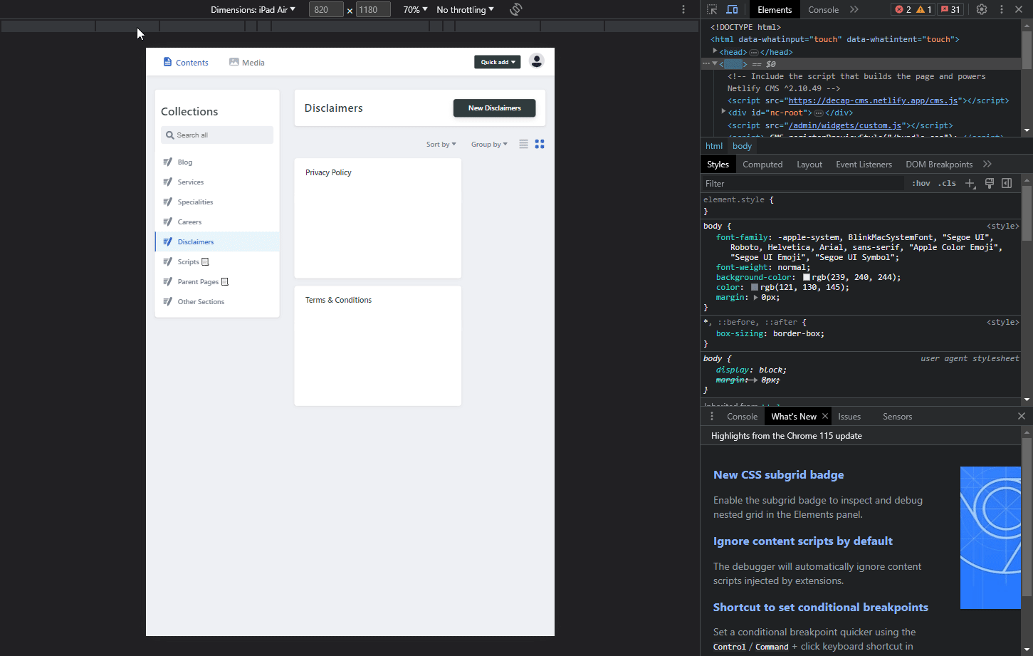
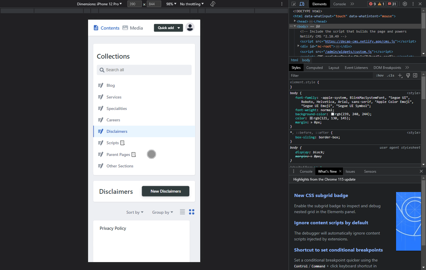
The mobile view of Decap CMS, as it stands, isn’t fully responsive. This means that the user interface doesn’t adapt well to different screen sizes, particularly smaller ones like those of mobile devices. This can lead to a poor user experience, with elements not fitting on the screen correctly or being difficult to interact with.
The screenshot below should give you a better picture:
The Community Solution
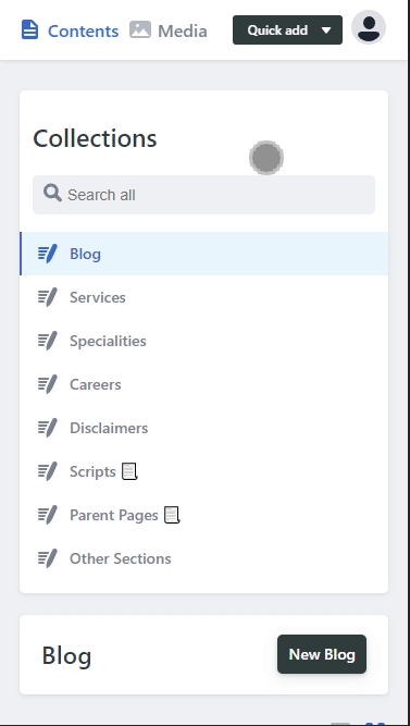
A gist by a Justin Searls provided a good starting point for addressing this issue. However, while it improved the situation, it still wasn’t fully optimized. The issue was primarily relating to many modal windows, dropdown boxes, and other elements not shrinking themselves to the viewport width, or still being hidden from the viewport altogether.
The screenshot below should give you a better picture:
My Adaptation
I’ve taken the initial solution and adapted it to further enhance the mobile responsiveness of Decap CMS. My adaptation addresses several issues, including:
- Making unresponsive elements responsive.
- Adding an overflow-x on any div that’s large.
- Hiding extra text from the DOM on mobile.
- Turning all modals/dropdowns into a single absolute position, so that you can at least see the values.
While my solution may not be the best from a UX perspective, it serves as a good temporary fix for any site requiring mobile optimization. Importantly, these changes only affect the mobile view, leaving the desktop view untouched.
Here’s how the mobile optimized view now looks after the implementations highlighted in the coming sections of this post.
Prerequisites / Assumptions (Before Implementation)
Before proceeding with the implementation, please ensure the following:
- You’ve already set up Decap CMS for your project.
- You’re looking for a functional implementation that focuses on mobile views, rather than retaining all UX elements on desktop. (This CSS file targets mobile views only.)
- You understand that attribute selectors (i.e., selectors with *=) are known to be relatively slow. However, for this specific use case, they offer a practical solution to achieve mobile responsiveness without drastically impacting performance.
- You understand that this file may conflict with any official solution by DecapCMS that may come up in the future.
Implementation
The installation steps are the same as the original gist. However, I’ve updated the CSS to include my adaptations. You can find the updated CSS code below.
Highlighting the steps mentioned by Justin Sears:
Your HTML file should simply include a “mobile-overrides.css” css file. Do note that that your HTML file should also include the ‘viewport’ section to enable mobile-responsiveness.
Manual Method:
<!doctype html>
<html>
   <head>
      <meta charset="utf-8" />
      <meta name="viewport" content="width=device-width, initial-scale=1.0" />
      <title>Content Manager</title>
   </head>
   <body>
      <!-- Include the script that builds the page and powers Netlify CMS -->
      <script src="https://unpkg.com/netlify-cms@^2.0.0/dist/netlify-cms.js"></script>
      <!-- IMPORT THIS FILE -->
      <link href="mobile-overrides.css" rel="stylesheet" />
   </body>
</html>
The final mobile-overrides.css file (stored in the same directory as your Decap CMS Location) should look like this:
/** Adapted By Mani Kumar (https://manikumar.in/blog/mobile-optimized-decap-netlify-cms/) From Source: https://gist.github.com/searls/7fd2c3223571a58a81006e7da66bd064 */
 @media (max-width: 799px) {
    /* Bring Any Dropdown To Center Of Page */
     [class*=DropdownList]{
         position: fixed;
         min-width: 20%;
         width: 90%;
         margin: auto;
         height: fit-content;
         top: auto;
         left: 0;
         right: 0;
         bottom: 10px;
         background: #e6f4fd;
         border: 2px solid #3a69c7;
    }
    /* Add Overflow To Modal Window */
     [class*=StyledModal]{
         width: 90dvw;
         width: 90%;
    }
     [class*=LibraryTitle]{
         display: none;
    }
     [class*=CollectionTopNewButton]{
         padding: 0px 10px !important;
         height: auto;
    }
     [class*=LibraryTop]{
         overflow-x: auto;
         height: fit-content;
         padding-bottom: 10px;
    }
    /* Hide Blog Post Title From Navbar */
     [class*=BackCollection]{
         display: none;
    }
    /* Add Padding To Control Pane */
     [class*=ControlPaneContainer] {
         padding: 0px 10px;
    }
    /* Rest As Per: Searl's Code*/
     [class*=BackCollection], [class*=BackStatus] {
         font-size: .6rem;
    }
     [class*=AppHeaderContent], [class*=AppMainContainer] {
         margin-right: 0;
         margin-left: 0;
         min-width: calc(100vw - 24px);
         max-width: 100vw;
    }
     [class*=AppHeaderContent] {
         display: flex;
         justify-content: space-between;
    }
     [class*=AppHeaderQuickNewButton] {
         width: 100%;
    }
     [class*=AppHeaderButton] {
         padding-left: 4px;
         padding-right: 4px;
    }
     [class*=EditorContainer], [class*=ToolbarContainer] {
         min-width: initial;
         overflow-x: auto;
    }
     [class*=ToolbarSubSectionFirst] {
         display: flex;
         flex-direction: column;
    }
     [class*=PublishedToolbarButton] {
         padding: 0 8px;
    }
     [class*=PublishedToolbarButton]::after {
         display: none;
    }
     [class*=ToolbarSubSectionFirst] {
         flex-direction: row;
    }
     [class*=SearchInput] {
         margin-top: 5px;
    }
     [class*=ViewControls] {
         position: initial;
    }
     [class*=PreviewPaneContainer-ControlPaneContainer] {
         padding: 0;
    }
     [class*=ControlPaneContainer] {
         max-width: 100vw;
    }
     [class*=EditorControlBar] [class*=ToolbarContainer] {
         display: flex;
         flex-direction: column;
    }
     [class*=CollectionContainer] {
         display: flex;
         flex-direction: column;
    }
     [class*=SidebarContainer] {
         position: initial;
         width: initial;
    }
     [class*=CollectionMain] {
         padding-left: 0;
         margin-top: 20px;
    }
}
I’m fairly certain that attribute selectors should work on most modern mobile browsers, it is important to know that attribute selectors with *= are known to be slow.
Using jsDelivr CDN: Alternatively, you could also import the css file via this cdn link in your header:
<link rel="stylesheet" href="https://cdn.jsdelivr.net/gh/hithismani/responsive-decap@main/dist/responsive.css"> <!-- Unminfied -->

<link rel="stylesheet" href="https://cdn.jsdelivr.net/gh/hithismani/responsive-decap@main/dist/responsive.min.css"> <!-- Untested, but Minified -->
Troubleshooting
If you encounter any issues or have questions about this implementation, please feel free to open an issue in this repository. I’ll do my best to assist you and improve the solution.
Conclusion
I’ve been using my adaptation for a number of client sites, and the feedback has been overwhelmingly positive. All features, including the media library, work great, with the exception of an issue where it hides on extremely small viewports. However, this is likely to be an edge case.
In conclusion, while there’s always room for improvement, this adaptation provides a significant step forward in optimizing the mobile view for Decap CMS. I hope you find it useful and I look forward to hearing your feedback.
This is still a simple community solution, but is meant to at least give you a temporary fix till Decap doesn’t officially support mobiles yet. For further adaptations or discussions, feel free to join the Decap CMS Discord server.